


Taking Stock
U.S. Inequity in International Context

... humility and freedom go hand in hand. Only a humble person can be free.
~Jeff Wilson, “Buddhism of the Heart: Reflections on Shin Buddhism and Inner Togetherness”
The Greenie Board
Some of my most enduring memories still evoke the scents of jet fuel and sea spray. In a previous career, I flew A-6E Intruders for the U.S. Navy. Intruders were carrier-based jets that served as props for one of the worst war movies ever (although based on a good book). Even if you watched the movie, though, you might not know that every attempt to land a jet on a boat is graded.
Each carrier landing is monitored from the flight deck by other pilots specially trained as landing signal officers (LSOs). A senior LSO verbalizes in real time any deviations from the ideal approach while a junior LSO takes notes. They assign an overall grade with a final note about which, if any, “wire” (actually a one-inch-diameter braided steel cable) the pilot snagged.
LSOs debrief pilots about their landings, then post their color-coded grades. An ‘OK’ grade, the highest grade one should hope to receive, is green. Thus the greenie board. Average grades fall between ‘OK’ and ‘fair,’ the next lower grade. There is such a grade as ‘good,' but in my hundreds of carrier landings plus the thousands I witnessed, I have only known of one ‘good.’ The guy had an engine failure and still managed to fly what would otherwise have been an ‘OK.’
Both over-confidence and under-confidence can be deadly in that job. Naval aviators lean over-confident, so their self-assessments need to be calibrated regularly. Publicly posted carrier landing grades accomplish that by replacing a pilot's natural self-satisfaction, easily derived from any successful landing, with a desire for continuous improvement. Thus, competitiveness, and maybe a little vanity, serve a somewhat higher purpose in this setting. I assure you, there were times when just “getting aboard” once more seemed good enough to me! I would have been perfectly self-satisfied. But that is short-sighted, and short-sighted is the enemy of sustainable excellence.
Right, so what about us, then? How is the United States doing compared to our peers? How green is our greenie board?
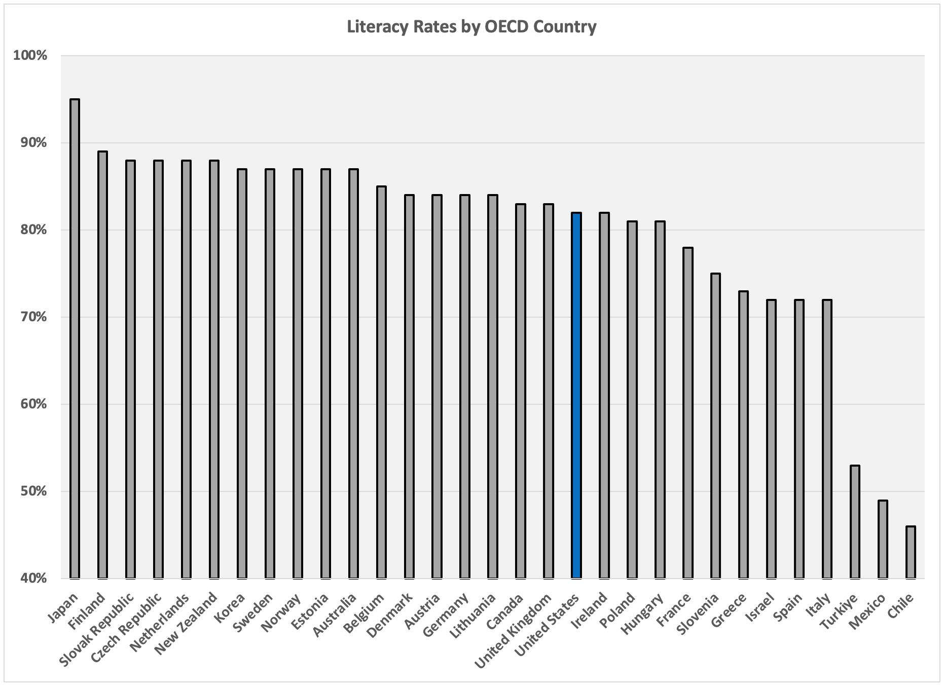
Literacy Rates in OECD Countries
I count our peer countries as those in the Organisation for Economic Co-operation and Development (OECD). The 38 OECD countries are what most of us would call “developed,” and describe themselves as committed to democracy. Most of them are wealthy and stable. Most are in Europe or North America.
In my previous post, I showed that three inequity metrics — literacy rate, life expectancy at birth, and infant mortality rates — are, taken together, a strong predictor for median household income in U.S. counties. In this post, I compare countries in the OECD using those same three metrics. We shouldn't expect that they will predict country-level median incomes — there are too many other variables at play at the country level. Nevertheless, we know they are important for us, so it makes sense to put U.S. education and health care performance in the context of our peer countries. I’ll start with literacy.
Thirty-one OECD countries participated in the PIAAC literacy assessments I described in my The U.S. Illiteracy Spiral post. The graph at the top of this post shows how we did in 2019. Not even in the top half. Given that literacy rates predict a nation’s productivity and GDP growth, our mediocre showing seems worthy of focused attention.
Unfortunately, that is as good as the news in this post gets — sorry.
Health Care Comparisons

Our average life expectancy in 2020 was 77 years, 32nd among the 38 OECD countries. I considered using lifespan data from 2018 — before the pandemic — to side-step any life expectancy variations due to differences in nations’ reactions to Covid-19. At that time, we ranked 29th with a life expectancy of 79 years. So even before the pandemic, we died earlier than most. Then to make matters worse, the pandemic hit us harder. But that is not the pandemic’s fault, is it? That is how we performed in the face of adversity. So the lifespan data in the graph above is from 2020.
Really, though, life expectancy is for old people, and old people aren’t so productive any more. What about our future producers, then — the babies? Do we take better care of them?
Nope. Worse, in fact. In infant mortality among OECD countries, we are 33rd of 38. In my view, no one is more innocent than a baby — of any color or from parents of any income.
The Hint of a Bright Spot
As mentioned above, we cannot expect three inequity metrics to accurately predict a nation’s median income. The analysis I did here was in the context of a single country — namely, the U.S., a very different place than, say, the Slovak Republic (our most comparable country in terms of my preferred health care metrics, but also the third most literate OECD country) or Ireland (with whom we are tied in literacy while they far outstrip our health care performance).
As it turns out, though, we have one of the top median incomes among the 37 OECD countries for which I have 2022 data — top 15% anyway. I count that as a bright(ish) spot that gets a notch better when paired with a specific bit of data from the World Happiness Report. To be clear, the bright spot is one of possibilities more than current realities, but worth a closer look all the same…which I will get to in a later post.
In average (mean) income, the U.S. does a bit better than in median income, placing third. But median income better captures the experience most people have — it’s a better representation of typical. In fact, our median and mean results are different precisely because of our high income inequality. So what about income inequality, then?
The Income Gini Index
The Gini index is a common income and wealth inequality metric. It measures deviations in a population’s income distribution from perfectly equal. The index ranges from 0 to 1, with lower being better. The OECD tracks the Gini index for its member countries in two specific scenarios: before taxes and transfers, and after taxes and transfers. The following results show the post-tax-and-transfer Gini index in 2018 (2017 for Iceland and Chile). I show post-tax-and-transfer results because they incorporate governments’ attempts to minimize income inequality.
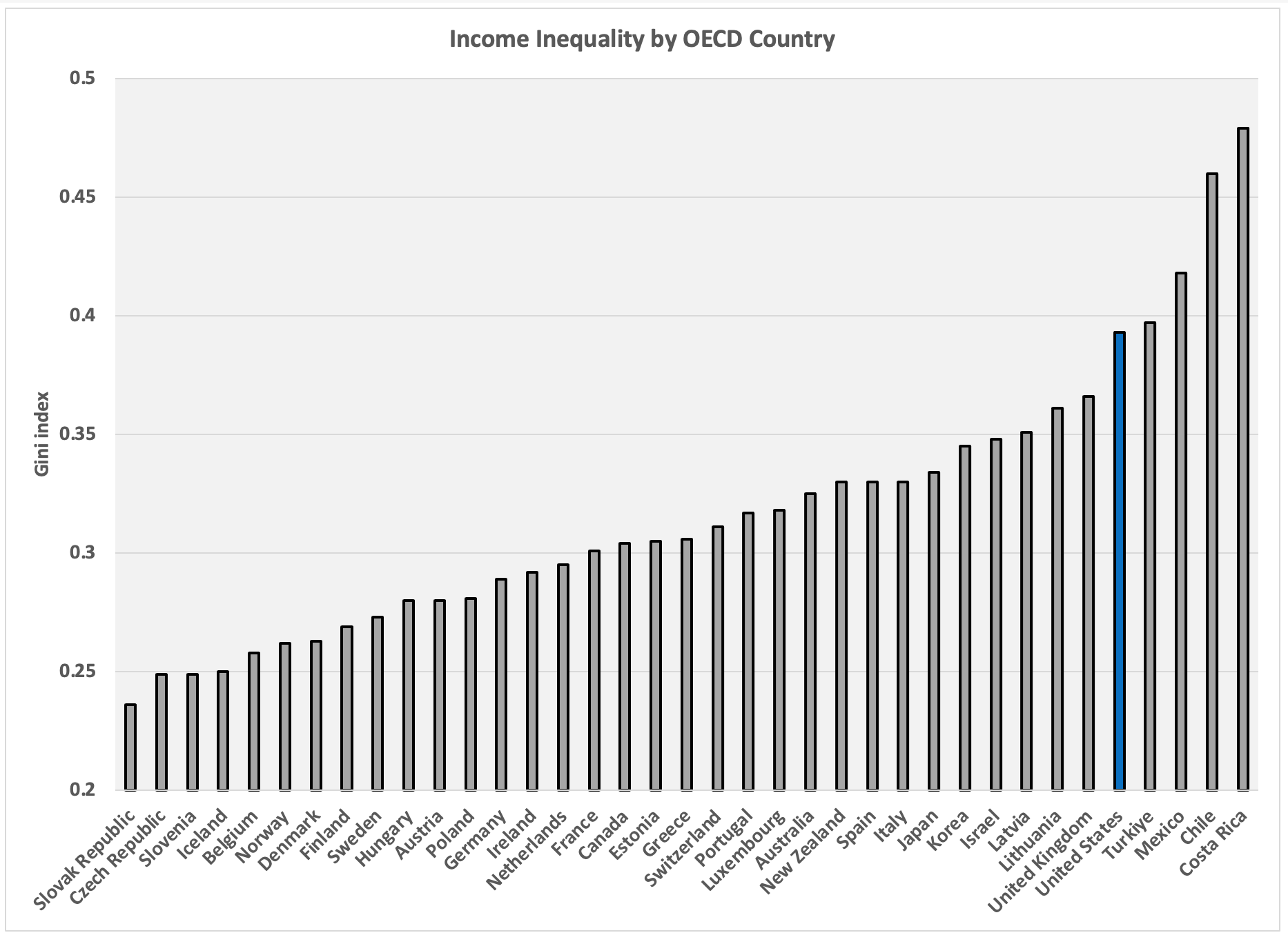
Recall that income inequality, at least in the U.S., is due mostly to inequity, not work ethic, intellect, or character. And the U.S. is 33rd of the 37 OECD countries for which I have data. That is after we ostensibly try to offset inequity with government programs funded by taxes.
Do we count that as good enough?
Next up: In the U.S., income inequality is linked to deaths of despair. How do we compare in that regard to other OECD countries?
These analyses are exactly the type of self reflection we need in this country. Few people realize how we are missing out relative to the advancements of our peers. I also love the military references because so many leadership and social advancements have been made in our military that haven’t been realized in our society at large.